
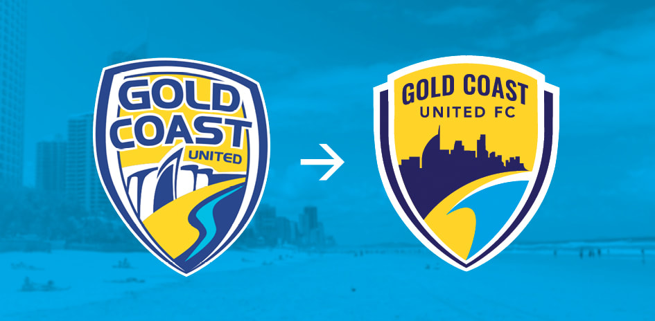
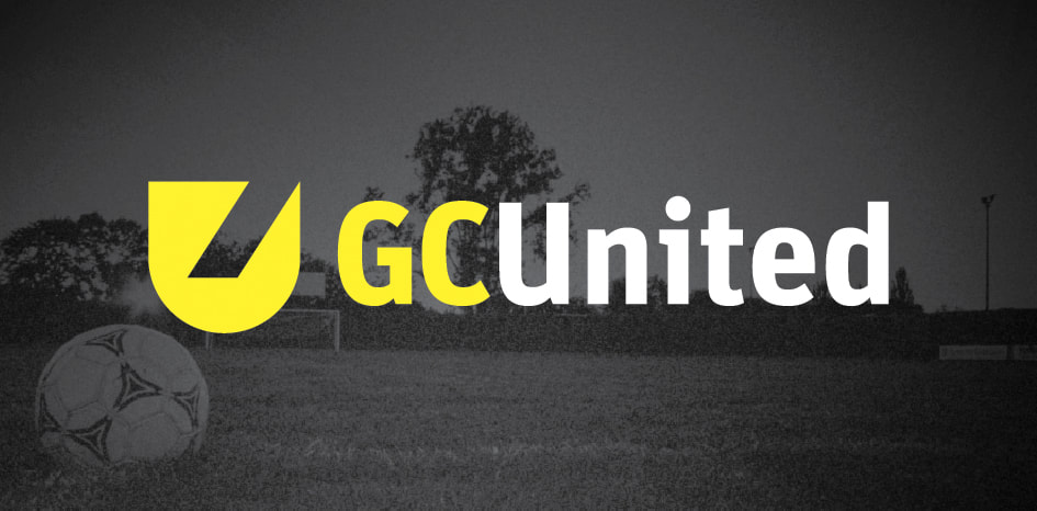
The Gold Coast United soccer brand has been rebooted as an NPL team Here's a behind the scenes look at 2 logo options Headline Creative developed for United FC’s new Board to consider...
One option follows the BW tradition of some great international clubs and gives a nod to heraldry as well. It captures all the grit and emotion of war on the pitch.
The other is a simple update of the old United logo (which still had about 5000+ diehard supporters). The reboot logo can be easily tweaked again if the club makes A-League/W-League or the Gold Coast skyline changes again... Which it will. I’ll let you guess which logo option United fans voted for via FB. Fortune might favour the brave... but nostalgia can be a brand's best friend. Other press: http://theworldgame.sbs.com.au/article/2017/08/03/gold-coast-united-back-dead
0 Comments
Leave a Reply. |
HELLOWelcome behind the scenes to the "Logo Logo" engine room. This blog is the place we park latest logo designs and tune-up old B-sides. You'll find a few logo design tips plus bonus content for the book Logo Process. CATEGORIES
All
RESOURCES


|
|
Location:
Servicing south east Queensland areas including Beenleigh, Yatala, Logan, Springwood, Underwood, Gold Coast, Brisbane. Online service available business hours AEST Australia (GMT +10:00). – – – – – What you need to know: No GST payable. *Prices exclude extra concepts ($80-$120 each) and logos for sale on merchandise (expanded licences available). **Artwork credit is valid 12 months from approval of logo concept. – – – – – Trademarks (™): This website contains original artistic works and intellectual property authored by Luke Sleaford. Logos are shown for portfolio purposes. They should be considered trade marks (™) and the intellectual property of their assigned owners. The '3Ls' (LLL) symbol is a trade mark (™) of Luke Sleaford T/A logologologo.com.au ("Logo Logo Logo, "Logo Logo" or "LLL"). – – – – – © Copyright 2024 Logologologo.com.au ("Logo Logo Logo, "Logo Logo" or "LLL") – – – – – |