
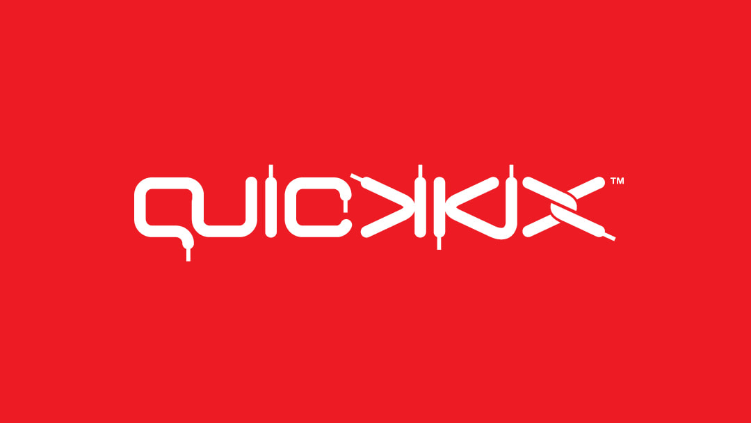
Latest Logo: Preview This original logotype was developed through Headline are for a young entrepreneur who sells designer kicks... (Those limited release shoes that are hard to find). Read more of the story below… Concept 1. (Red shirt) This first concept is inspired by shoe laces. Those lace 'ends' on the letters actually have a name – they're called 'aglets'. Face it, a logo can never have enough aglets. 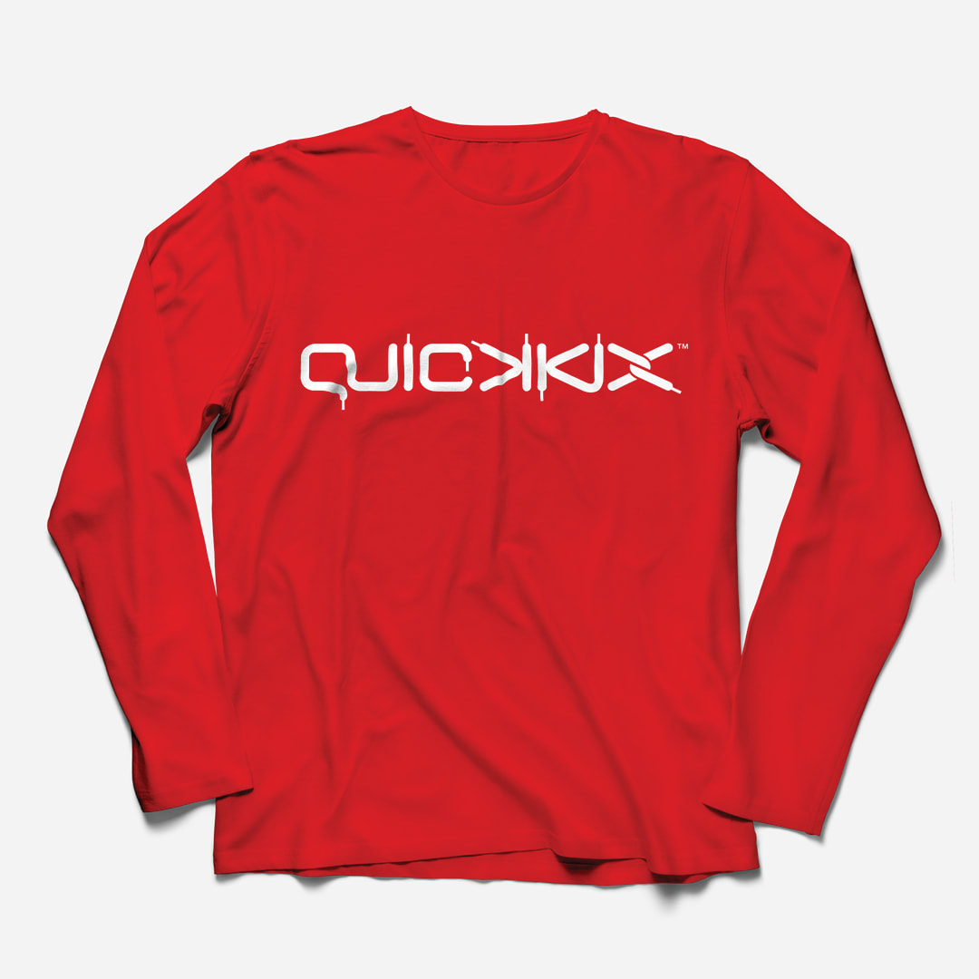
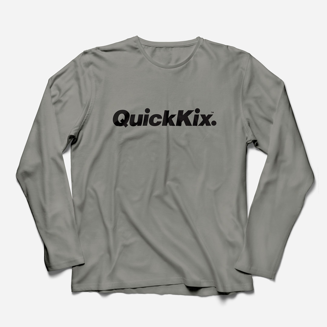
Concept 2. (Grey shirt) The second concept is a play on vintage brand logotype and word marks. It started out as Helvetica (the hardest working font in the world). So, it feels familiar straight away. 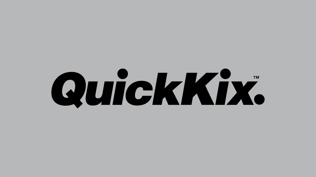
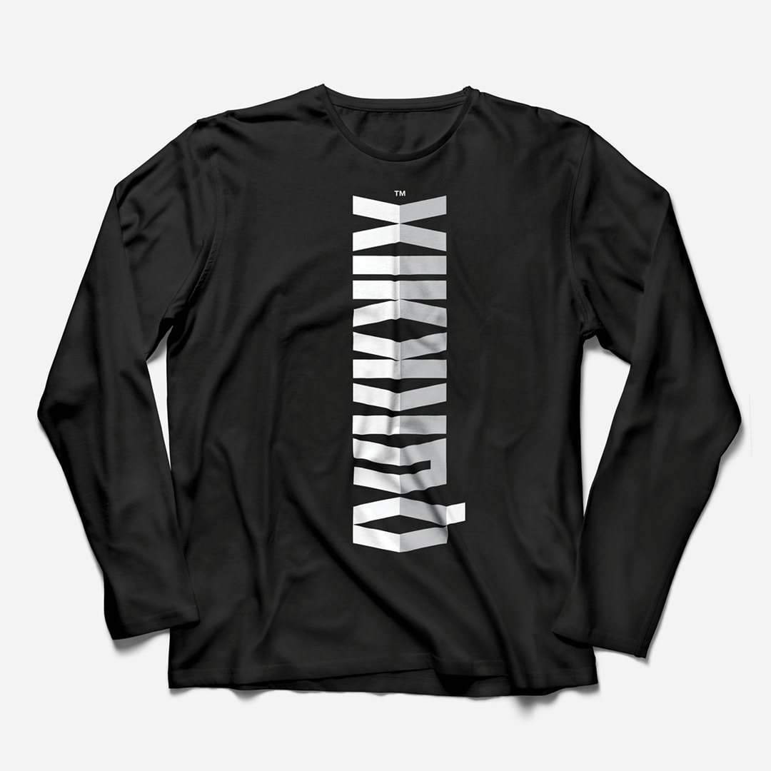
Concept 3. (Black shirt)
The third logotype is a bit different – it's a custom font made out of chevrons and is deliberately hard to read. Why, you ask? It's designed to help build a loyal tribe of customers who are 'in the know' by locking other customers out. It's not as crazy as it sounds... Street (graffiti) artists use the same principal in murals and tags that make no sense to 99% of people passing on a train. 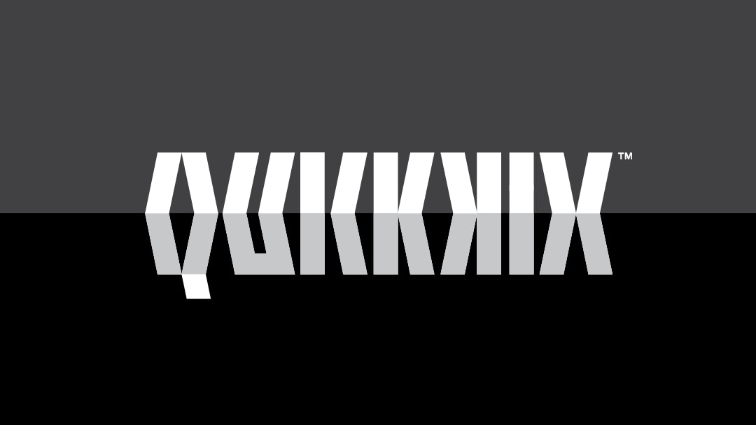
Comments are closed.
|
HELLOWelcome behind the scenes to the "Logo Logo" engine room. This blog is the place we park latest logo designs and tune-up old B-sides. You'll find a few logo design tips plus bonus content for the book Logo Process. CATEGORIES
All
RESOURCES


|
|
Location:
Servicing south east Queensland areas including Beenleigh, Yatala, Logan, Springwood, Underwood, Gold Coast, Brisbane. Online service available business hours AEST Australia (GMT +10:00). – – – – – What you need to know: No GST payable. *Prices exclude extra concepts ($80-$120 each) and logos for sale on merchandise (expanded licences available). **Artwork credit is valid 12 months from approval of logo concept. – – – – – Trademarks (™): This website contains original artistic works and intellectual property authored by Luke Sleaford. Logos are shown for portfolio purposes. They should be considered trade marks (™) and the intellectual property of their assigned owners. The '3Ls' (LLL) symbol is a trade mark (™) of Luke Sleaford T/A logologologo.com.au ("Logo Logo Logo, "Logo Logo" or "LLL"). – – – – – © Copyright 2024 Logologologo.com.au ("Logo Logo Logo, "Logo Logo" or "LLL") – – – – – |