

Are modern logos boring? "Think outside the box"… As designers, we're always told to do it. We invented new technology to help us do it. We even re-branded it 'blue sky thinking'. But, it can feel like in the online age, all our thinking outside the box has gotten us more... well, boxes. Here's how... It's a strange time for designers... profile pics and app icons mean logos have to fit square boxes and circles again. Funnily enough, back when I studied design we were roasted for presenting logos that were circles or squares – it was considered too '60s'... too conventional... too 'inside the box'. Now it seems websites and social media companies have caught a case of 'the boxes' too. And it's contagious. An algorithm somewhere says video content is king for a while. So, picture boxes end up 16:9 just in case a little picture box grows up to become a video one day. Corporate logotypes are straight off the TypeKit or Google fonts list. It's the same story for profile pics. Round or square. Round or square. Triangles anyone? Nope. Just round or square. I feel something coming... uh-oh, it's a potential industry buzzword... 'Pixel Dependence Syndrome'. pixel dependence syndrome adjective relying on social media channels as your only form of advertising while checking FB on a smartphone that was advertised on traditional media like TV... a billboard... and retailers' junk mail
Here's a history lesson a client shared with me from 'the good old days' to help remember the big picture and avoid the potential pitfall of 'pixel-dependence-syndrome'...
"Extra! Extra! Read all about it!"… That little kid in a newsboy cap calling out from a street corner was actually the social media of his day. Yep, that's right. The printed Extra! edition being spruiked on the streets of New York and Chicago were a trending news Insta-Snap... and those newspapers were distributed to the public for mere pennies. That made them valuable to readers... and valuable to advertisers who wanted to reach those readers. Bought a newspaper lately? Didn't think so. The same way that kid in the newsboy cap grew up and started running errands for the Mafia, change was inevitable. Newspapers charged more and more. Customers wore it for about a century. Advertisers piled in that entire time. Then, something changed. Newspapers started to look like a 200 page real estate section with a few articles taped to the front end – and it killed our appetite for the media form. It became 'white noise'. End flashback. Now, on to today... Bought any social media or digital ad space lately? Of course you have. If your marketing team are digital natives born with a USB port instead of a bellybutton, digital is probably the only form of marketing they've ever known. And new media is innovative, right?... It's new so it must be, eh? It's true that new media platforms started without boxes. Our willingness to give bulk data to mega-corporations voluntarily so they can predict how we buy was unprecedented in human history – it truly was out of the box... (For those data-vacuuming companies, that is... not us as customers.) But, remember the lesson from that kid in the newsboy cap... The newspaper he was waving used to only cost a few pennies. And those new media platforms we think are so innovative share a problem with 'old media' like newspapers. They need to monetise to keep on existing. What's makes the digital age different to the newsprint era? Well, for a start, we have automated production at every step in the consumption cycle. Put simply, we're more efficient at producing and consuming stuff, stuff and more stuff – including online content. So, the scenario is scaled way, way up from the few rolls of pulped tree and some lead-laced ink that a newspaper came on. But here's another difference. One worth thinking about for a bit... To keep things so automated and efficient, we pay for every step in the process. (Us, not the moguls behind our technology.) Back in the day, newspaper kingpins had to flop down their own hard-won cash to buy bigger printing presses and maintain a larger staff to expand their distribution. Today, new media platforms face the same challenge to keep expanding... but instead of thinking outside the box, our new media forms find their solution inside that same, old proven box. They just charge customers and advertisers for access. But on a global scale! As digital customers, we're don't just pay for a few sheets of paper to consume our media... Think about it... We pay for smart devices made using petro-chemical plastics, noble metals, and the odd rare earth minerals.. We pay telcos for infrastructure and subscription plans to access those devices... We pay again to have our content placed and seen... and all the while, we pay companies or governments to build and run power stations to keep the screens switched on 24/7. Is any of this sounding 'out of the box'?… Sounds like the same old cycle of waste to me. And at least newspapers enjoyed a second life wrapping up fish and chips or garbage before they made it to the landfill. What's the lesson in all of this? Well, ignoring new media can be dangerous. (It's a great time for designer to explore new ways to deliver messages... too actually 'create'). But, 'pixel dependence syndrome' is just dangerous. That's why Facebook advertised on bus shelters a while back. And why Google advertises their phones on your television set. Pay attention and you'll notice non-digital ads for online news services. Even ride sharing apps. I've heard clients say they destroyed their brand's momentum by abandoning their 'old' media for a purely online presence. It's not that digital is bad – it was just a bad fit for their product and digital doesn't have the cut same through it did when it was 'new'. My advice? For sure, make sure you get the most out of digital and social channels. But don't risk becoming white noise. Some people don't realise white noise is even there. It just puts others to sleep... I'm reminded of it every time I see a 'new' round logo. If you enjoyed this article discussing the challenges and opportunities of logo design in the online age, I encourage you to get in touch via the contact page. Or, share this article with clients and designers who might benefit.
0 Comments
Leave a Reply. |
HELLOWelcome behind the scenes to the "Logo Logo" engine room. This blog is the place we park latest logo designs and tune-up old B-sides. You'll find a few logo design tips plus bonus content for the book Logo Process. CATEGORIES
All
RESOURCES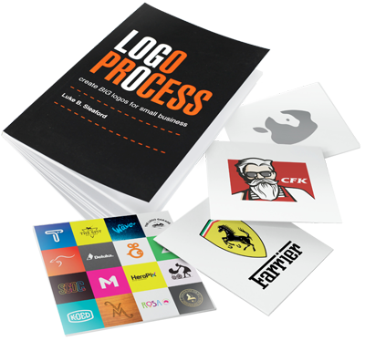


|
|
Location:
Servicing south east Queensland areas including Beenleigh, Yatala, Logan, Springwood, Underwood, Gold Coast, Brisbane. Online service available business hours AEST Australia (GMT +10:00). – – – – – What you need to know: No GST payable. *Prices exclude extra concepts ($80-$120 each) and logos for sale on merchandise (expanded licences available). **Artwork credit is valid 12 months from approval of logo concept. – – – – – Trademarks (™): This website contains original artistic works and intellectual property authored by Luke Sleaford. Logos are shown for portfolio purposes. They should be considered trade marks (™) and the intellectual property of their assigned owners. The '3Ls' (LLL) symbol is a trade mark (™) of Luke Sleaford T/A logologologo.com.au ("Logo Logo Logo, "Logo Logo" or "LLL"). – – – – – © Copyright 2024 Logologologo.com.au ("Logo Logo Logo, "Logo Logo" or "LLL") – – – – – |