
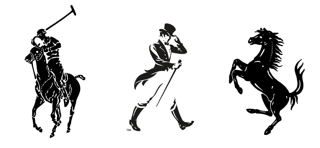
Logos capturing movement that have stood the test of time: Polo's rider; Johnnie Walker's dandy; Ferrari's prancing horse
How to capture movement in a logo
Some of the most unique logos out there show 'a happening' - an action taking place. They capture a moment in time that sums up everything customers aspire to at a glance. They can also have a really long shelf life for brands that adopt them.
Here are some tips on how to create a logo that captures movement successfully... 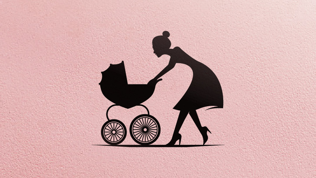
1. Choose the right gesture
To get action really popping in a logo, you'll need to capture a 'gesture'. The visual language of gestures connects to our understanding of body language. It's animal posturing. And it's primal. Logos that capture action speak to parts of our brain that process visual info like posture and expression. Our brains can translate all that info into an intention in a fraction of a second. Is this thing a threat? Is it desirable? Is this a situation I want to be in? Our brains learn to form conclusions like this as developing children, and the process stays with us our entire lives. For this reason, gesture can capture more emotion in a logo than geometry or colour achieve on their own. An example... when you see Ralph Lauren's polo rider, Ferrari's prancing horse, or Johnnie Walker's dandy out for a stroll, it's not the finished art treatment that conveys a sense of bravado, dominance and prestige – it's the gesture of the subjects. To create your own action logo, think more like a storyboard artist than a logo artist. You're creating a memorable still frame. Your logo isn't just a shape anymore, it's become an actor. When creating an action logo, it's important to choose a subject matter that can actually make a gesture too – not just add some 'speed lines' to an inanimate object. 
2. Simplify line work
Another skill designers tackling an 'action logo' need to master is simplifying line work. Complex, illustrated lines need to be simplified to reproduce properly as a logo – especially at small sizes. When in doubt, trace your design, then re-trace the tracing. The design will simplify a little more each time. If you're comfortable going old school, use tracing paper and a pencil. The larger you work, the more fluid your lines can be. If you prefer your drawing tablet, create a new software layer for each 'tracing' you make.
3. Light and shade
If your action logo is more than a silhouette and needs some volume, the way light falls across the subject will alter the emotion you convey. Light can add drama, but needs to take into account end uses for the logo. Your logo may be used in single colour commercial processes like printed packages or plastic moulding (and not just seen on screen). That means it may need to work as a flat, solid shape. When this is the case, light can't appear as shading or a gradient – you'll need to let negative space in the design tell the story instead. Last of all, decide if the subject needs a shadow. Your design probably won't be a scene or landscape that has a horizon for reference. A shadow can help anchor a design that feels floating or lost in space.
4. Paint your thousand words
Did you know most alphabets around the world developed from pictograms? – simple pictures of animals, things and actions? Chinese characters started out as pictures (and still are). So did the Phoenician shapes that gave rise to Greek and Latin alphabets. (They're the basis of modern English letters.) Action-based logos should feel like an exciting piece of writing – they're the 'verbs', not the boring 'nouns'. Remember the proverb "A picture is worth a thousand words". Your action logo will be ready when there's a verb or two that matches your logo perfectly the same way Johnnie Walker 'struts' and Ferrari's horse 'prances'.
Examples above
Action logos can need a lot more budget to develop than static, geometric logos. That said, they're a great investment for brands that want to engage customers instantly on an emotional level. I developed the bounding kangaroo above for Headline Publishing to use on invitation kits. It only gets a few, short seconds to pique interest from some heavy hitters in Australian business when they open their mail. (Or, it risks ending up in the bin under the Uber coupons and pizza offers). It also needs to be simple enough to die cut. The mum with the pram above is a B-side from my archives. Damn, those heals!... Unrealistic? Maybe. Maybe not if you've ever seen the client's customers. If you enjoyed this article where I've explained how to capture movement in your next logo, I encourage you to get in touch via the contact page, or check out my book Logo Process in the menu above.
1 Comment
Gunner
22/4/2019 12:13:29 am
Hi, very nice website, cheers! Leave a Reply. |
HELLOWelcome behind the scenes to the "Logo Logo" engine room. This blog is the place we park latest logo designs and tune-up old B-sides. You'll find a few logo design tips plus bonus content for the book Logo Process. CATEGORIES
All
RESOURCES


|
|
Location:
Servicing south east Queensland areas including Beenleigh, Yatala, Logan, Springwood, Underwood, Gold Coast, Brisbane. Online service available business hours AEST Australia (GMT +10:00). – – – – – What you need to know: No GST payable. *Prices exclude extra concepts ($80-$120 each) and logos for sale on merchandise (expanded licences available). **Artwork credit is valid 12 months from approval of logo concept. – – – – – Trademarks (™): This website contains original artistic works and intellectual property authored by Luke Sleaford. Logos are shown for portfolio purposes. They should be considered trade marks (™) and the intellectual property of their assigned owners. The '3Ls' (LLL) symbol is a trade mark (™) of Luke Sleaford T/A logologologo.com.au ("Logo Logo Logo, "Logo Logo" or "LLL"). – – – – – © Copyright 2024 Logologologo.com.au ("Logo Logo Logo, "Logo Logo" or "LLL") – – – – – |